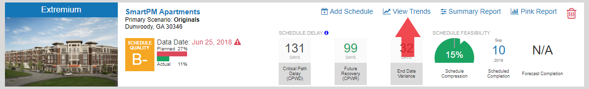
Trends!! Trends!! Trends!! We've taken the schedule data and created 9 insightful and informative trend graphs that you can access directly from your Company Dashboard. Just click "View Trends" icon on your Company Dashboard:
- Planned vs. Actual Percent Complete: We just had to have a standard "S"Curve illustrating planned percent complete versus actual percent complete. Enough said!
- Schedule Quality Trend: What is a Schedule without Quality.....a nice picture. Schedule Quality is an indicator of the underlying elements and adherence to best practices. A higher quality schedule improves the analytics and allows the schedule to be responsive to changes. View your Schedule Quality over time, spot dips in quality and correlate it with the amount of changes and delay occurring on the project.
- Schedule Changes Trend: C!@ng^s happen! No schedule is the same at the end as when it began. Use this graph to track all the different types of changes over time along with the number of total activities. Identify periods of significant change or large increases in activities and consider whether or not a re-baseline is warranted.
- Schedule Delay Trend: Take a look at this nifty graph to see your Critical Path Delay, Future Recovery, and End Date Variance over time. If delays are mounting but end dates aren't changing, you'll see your future recovery (e.g. adjustments to future activity logic, sequencing, and duration) start to offset the delays.
- Schedule Compression Trend: Compression doesn't happen overnight. It builds and builds until the project can't maintain it's scheduled end date resulting in significant changes being made and the end date pushing out. Use this graph to track the build up of compression over time and correlate it with the Schedule Changes and Schedule Delay Trends.
- Average Activity Float Trend: How much room is there in the schedule? Track Average Activity Float over time to follow float erosion and spot risks associated with Missing Logic trends.
- High Total Float Trend: Minimizing high float allows the schedule to be reactive. Schedules with many activities with high float can be indicative of flawed logic and have a risk of inefficiencies resulting in an erroneous critical path.
- Critical Path % Trend: Your critical activities are what you should be focused on. Too many or too little and the schedule is at risk of being misunderstood.
- Missing Logic Trend: Ultimately a graph you should look at first. Missing logic represents one of the greatest risks in a schedule and best practices would suggest that missing logic be held to a minimum.
Note that "Trends" can also be viewed in the Analysis Tab of your Project Dashboard. See a full print out example below.
Trends Graphs Example
That's not all folks.....other new features include:
- Automatic Universal Milestone Identification & Tracking for New Company Projects - Have company standard Milestones and Activities across all your projects. Upon request, SmartPM™ can be set to automatically identify similar milestones.
- Enhanced Filter Menu and Addition of Filter by WBS or Calendar - Making the filter function in the Gantt Chart more effective by adding WBS and Calendars to allow you to filter activities on a certain Calendar or WBS.
- Auto Check for Data Date on MPP Project Creation - Got MPP, yeah you know me! Data dates are critical to analyzing the data. SmartPM™ will autocheck for the data date upon import.
- Ability to Revert Fragnets Over Multiple Windows - Use the Revert Condition to send changes back across multiple windows or periods.
From all of us here at the SmartPM™, thank you for being a part of our team. Your feedback is the most important part of the evolution of SmartPM™, so please continue to reach out with ideas, thoughts, and tweaks you’d like to see in upcoming SmartPM™ updates.
The SmartPM Team